

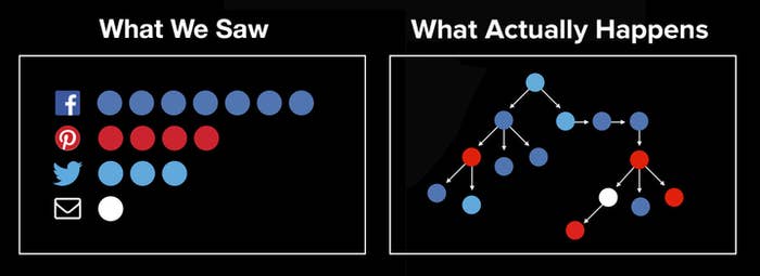
Traditional web analytics provide limited insight about the social web. They can "bucket" a story's viewers according to where they clicked from, and tell us how many are in each bucket. That data is valuable and especially suited to a "pre-sharing" world. But traditional web analytics are fundamentally unable to capture what actually happens on the social web today; they obliterate its inherent tree structure.
As one of the leading social news and entertainment organizations, BuzzFeed has its content shared by tens of millions of people every month. Over 75% of our 200M monthly users come from social or dark social sources. This scale provides a unique opportunity to learn about the tree structure of network diffusion of social content. What happens when you tweet something and a follower picks it up and shares it on Facebook, and then one of their friends posts it on a blog, and then a reader emails it to her friends? What could we learn from how content really moves across the social web?
What is Pound?
Pound is a new, proprietary technology that captures how BuzzFeed stories spread on the social web. It follows propagations from one sharer to another, through all the downstream visits, even across social networks and one-to-one sharing platforms like Gchat and email.
Pound is the Process for Optimizing and Understanding Network Diffusion.
Pound does not store usernames or any personally identifiable information (PII) with the share events. Each node in the sharing graph is anonymous. We are not able to figure out who a user is by looking at the graph data. Pound data is collected based on an oscillating, anonymous hash in a sharer's URL as a UTM code.
Gathering and storing this kind of network diffusion data was a hefty engineering challenge. Pound, under a typical load, is capable of handling well over 10,000 web requests per second before scaling. As a result, we now store more Pound data in a single month than all the other data we have previously collected for content optimization since the inception of BuzzFeed.
The knowledge held in this unprecedented data set could help us understand our content better, understand our readers better, and understand the social web better. Armed with that understanding, we can have bigger reach and bigger impact for our readers and on the world.
Three things we have learned from Pound data so far
1. It’s about forests, not trees.
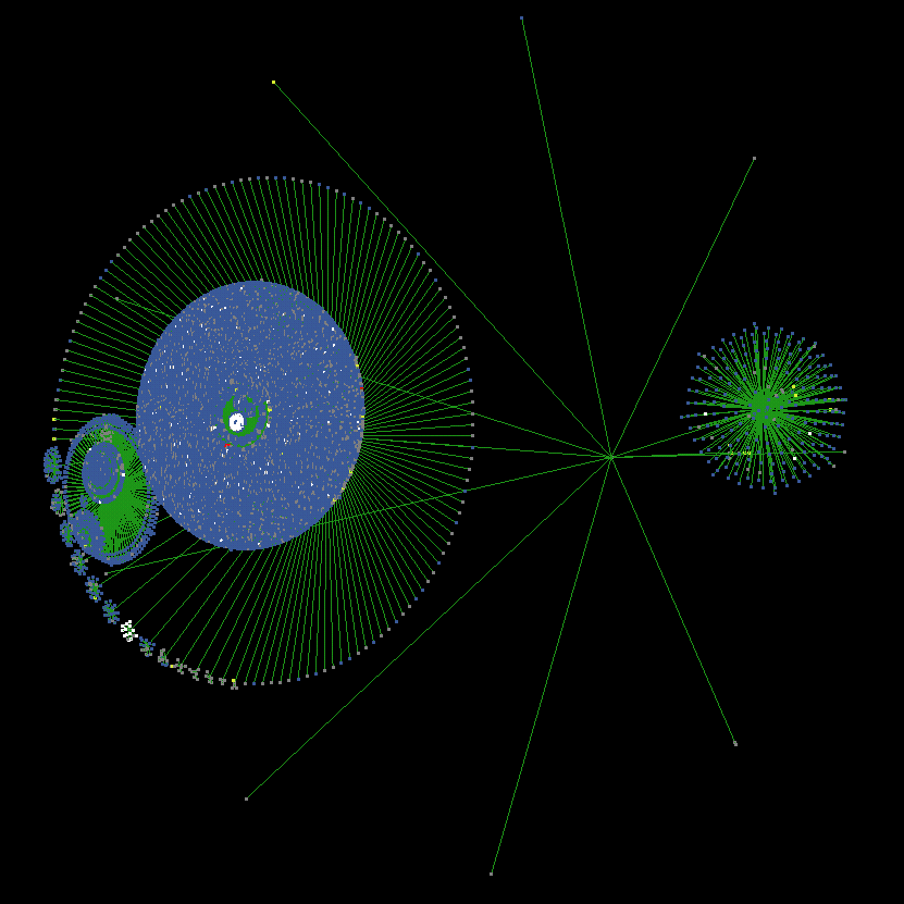
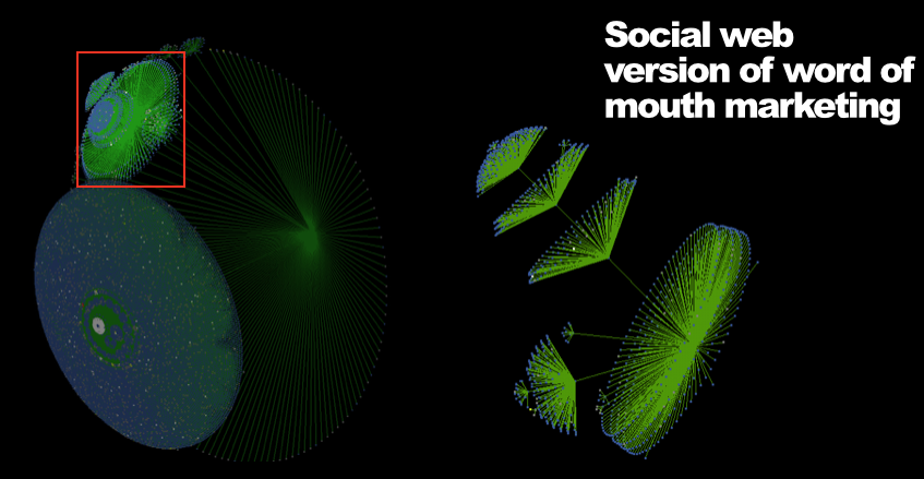
We initially thought that the data could be represented in a single "tree" diagram like the one above. But we quickly realized that every post has hundreds or thousands of initial sharers, each the root of its own tree. The Pound graph for each story thus looks more like a forest than a tree. And in this forest, the trees can look radically different. Some are fat (lots of downstream nodes), some are thin; some are deep (lots of sharing cascades), some are shallow; some have cross-network propagations, some do not. The structure of the forest and its trees tells us in great detail about how each post spreads.
2. Social networks and promotions should be valued by their entire downstream cascade.
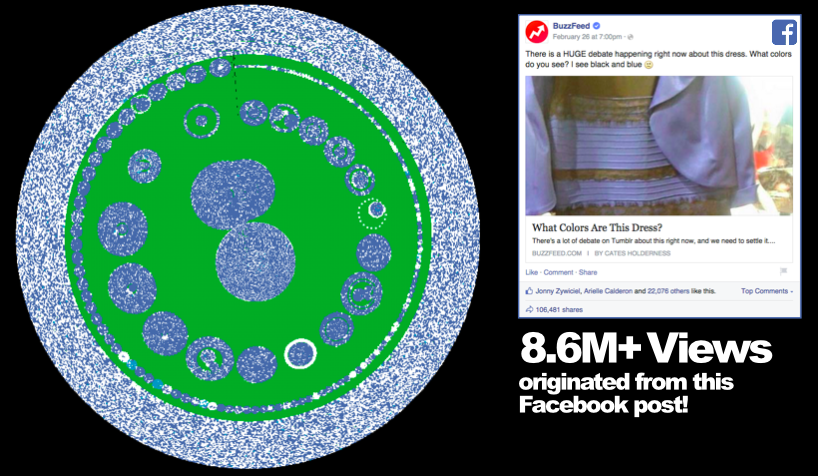
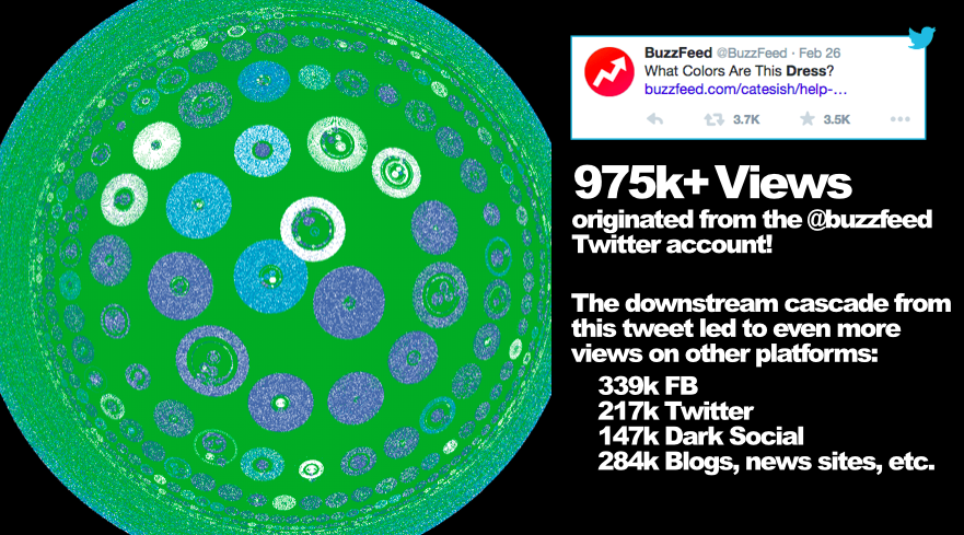
In February of this year, BuzzFeed published a post about a dress. It has been viewed over 38 million times.
The Pound data showed, possibly for the first time in history, how a viral post spread via millions of sharers across social networks, messaging systems, news sites, and blogs.
3. Sponsored content is shared and re-shared just like editorial content.
We have known this for a long time, but Pound data proves it. Here's an example. BuzzFeed's Creative Services team partnered with Target to write "I Tried The Fanny Basket And It Saved My Life" right before April Fools' Day. The post was quite successful with over 400,000 views. Let's take a look at some of its Pound visualizations.
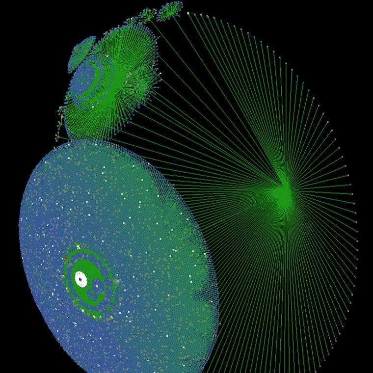
The visualization above shows an impressive depth of social sharing: the initial share led to seven additional levels of propagation, for a maximum depth of eight. (For comparison, that Twitter cluster of the “Dress” post had a maximum depth of 11.) Each circle of nodes represents an organic sharing network, or a group of people who saw the post as a result of an organic share. As with the "Dress" post, a white cluster in the center represents a publication discovering the story and linking to it on its site.
What's next for Pound?
We are so excited about the possibilities of using Pound! Here are just a few ideas that we have discussed.
* Can we propose stories that will appeal not only to you, but also to your friends and followers?
* Can we use Pound data to power A/B tests? Can we make the site and apps better not just for readers, but for their friends — and thereby increase the impact of our site?
* How effective are specific promotions, not just based on first-order traffic, but on all of the downstream sharing and traffic that results?
* Can we predict the potential reach of a story based on its content or other features about it?
* Can we filter out the effect of big sites or celebrities promoting our content, learn what average people actually like, and produce more of the right content for everyone?
Finally, can we do all of the above for sponsored content? In fact, we are currently seeking beta partners to help us think about how Pound data can benefit advertisers and their audiences. UPDATE 4/28: We are specifically looking for beta partners among our advertisers who work with us in an iterative partnership to continuously create content and learn from data findings.
We'll be sharing more throughout 2015 on everything from engineering and data architecture challenges to how we'll use Pound to make BuzzFeed better for our readers. We don't have all the answers to these fascinating questions yet, but we are hard at work on them!